360 Feedback Report Design - Examples and Samples
How feedback results are presented will either help or hinder the participant to make the most of their feedback opportunity. This group of brief articles outlines the areas for consideration when designing a 360 feedback report and provides lots of samples and examples of best practice.
Designing a 360 feedback report
When used to support personal development, the objectives of a 360 feedback report could to defined as...
To support going personal development via a greater understanding of:
- How own style/ approach is seen by others
- Strengths and development opportunities as perceived by others
- Any perception blind spots
To this end, 360 feedback reports should (as a minimum) be designed to enable the above whilst:
- Having a professional appearance, with good use of space, colour and font
- Providing enough feedback to allow the recipient to draw useful conclusions without tipping into information overload
- Taking account of different cognitive styles by presenting rater information in both image/graphic and number formats
- Presenting information in a way that is easy to:
- ‘Tune in ’ to scales, presentation formats etc.
- Spot key strengths, development opportunities and blind spots
- Pick out overarching behavioural themes/ patterns
- Following a logical (self-discovery) flow
- Providing a good balance between summative (average) ratings and individual rater perceptions whilst maintaining anonymity
- Providing verbatim comment input to enable insights into the impact of specific behaviours
The Lumus360 suite of 360 feedback reports, follow best practice design. See our sample 360 feedback reports.
David Cooper
Director - Lumus360
www.lumus360.co.uk
360 degree feedback report types
The most common types of 360 feedback reports are:
- Individual feedback report - Intended for use by the participant. A good 360 feedback report should provide developmental insight in a format that is clear, concise and easy to interpret, enabling the development of an action plan for performance improvement and career development.
- Have a balanced range of data presentation to allow for different cognitive styles; using graphics, numerical data, and text
- Have a professional appearance, with good use of space, colour and font
- Provide enough feedback to allow the recipient to draw useful conclusions without tipping into information overload
- Use well-researched graphic displays avoiding visual biases in order to reveal key patterns in behaviours
- Provide verbatim comment input to enable insights into the impact of specific behaviours
- Have a structured approach which provides more detailed information at each level, allowing for greater insight at each step
- Comparative reports - Used to measure/monitor an individual's progress over time - These reports combine and summarise the results of the persons old and new 360 reports, enabling behavioural change to be tracked. The key benefits are:
- A great way of analysing development progress over time
- Helps embed the importance of developmental feedback
- Provides input into continuous development planning
- Spot improved leadership behaviours
- Identify where little progress has been made
- Spot behaviours that have slipped
- Training needs analysis (group) reports - These reports merge the 360 degree feedback data from a cohort of recipients into one consolidated report, designed to provide HR professionals, senior teams and development professionals with high level insight into management development themes, culture and performance trends
In presenting the feedback data the report should:
Comparative reports should make it easy to:
Lumus360 offer all of these 360 feedback reports and are able to tailor their look, style, contents etc. to meet your preferences.
David Cooper
Director - Lumus360
www.lumus360.co.uk
Presenting feedback in a 360 feedback report
How 360 feedback information is represented within the report has a big impact on how it is received, interpreted and used. Applying the following guiding principles will ensure your report is as simple and easy to read as possible:
- Use appropriate presentation charts – The type and purpose of any data, defines its most suitable presentation format. In the case of 360 feedback, we are predominately ‘comparing the difference’ between multiple results where each has a similar weight.
- Bar chart
- Column graph
- Pie chart
- Use colour wisely – Colour is used to ‘emphases/ highlight’. In the case of 360 feedback reporting we recommend:
- When showing the feedback from each of the respondent groups, the aim should be to use colour to differentiate the respondent groups, not the importance of the data. Try to use soft, natural colours from the same pallet, avoiding colours that contrast.
- Because we want each data bar to have the same ‘weight’ as its neighbours, it’s important to ensure the background is consistent (the same colour and without the use of gradients) and lighter in shade
- When showing top – bottom ratings - The use of darker colours to highlight/ attract attention can work well
- In all cases, any non-data components (grid lines, axis’s, boarders etc) should be either left out or displayed just visibly enough to perform their role, but no more. A light grey works well
- Avoiding red and green in the same display will ensure most people who are colour-blind can distinguish groups of data
- Keep it simple and clear – Don’t overly complicate things by incorporating 3D, visual effects, visual clutter, stacked charts etc.
- Top up with numbers only if it adds value - Whilst it is fairly easy for readers to compare bar lengths and gauge approximate values from a bar chart, exact values can add more clarity where needed/ is important. Best practice is not to show an excessive amount of digits (6.5 is better that 6.54356 ) and place them in the middle or at the end of the bar
- Make the scale easy consistent and easy to reference – Aim to:
- Include axis lines to help contextualise the results
- Include the scale/ anchor point descriptors on each page
Therefore the presentation format should be one of the following:
Whilst personal preference plays a part, there is research that clearly indicates that information displayed horizontally is better than vertically and that we are not good at judging the relative differences in multiple pie charts, which leaves bar charts! Regardless of your preference, line, area, surface, combo graphs etc., are not suitable for this purpose.
David Cooper
Director - Lumus360
www.lumus360.co.uk
Examples of how to present the high level overview of 360 feedback results
When used for personal development, 360 feedback reports should take the reader on a purposefully designed journey of self-discovery. Lumus360 believe this should begin with the presentation of a high level overview that enables the identification of:
- Any large perception gaps – Either between:
- The participant and everyone else
- The participant and one of the feedback groups
- Different feedback groups
- Perceived strengths and development opportunities at competency/ dimension level
- Overall trends and discrepancies
- A sense of the competency/ behavioural areas that need greater understanding/ investigation
This ‘high level overview’ shouldn’t aim to provide all of the answers or a detailed analysis, but simply shine the light/ act as a bigger picture signpost to areas for further understanding. Below are some best practice examples of how to show high level 360 feedback report results.
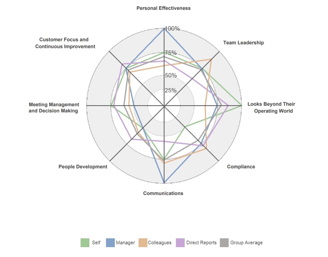
The two main options are a spider graph or bar chart:
Spider Graph - The best spider graphs:
- Have a clear scale with shading to differential between the key increments
- Use colour wisely, are simple and clean of clutter
Something like this...
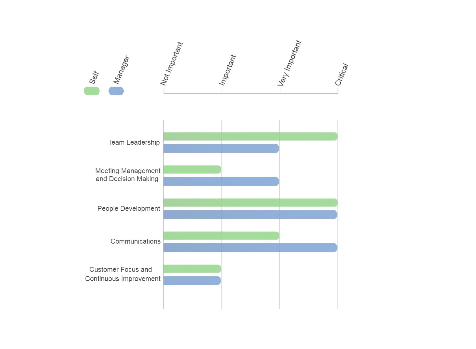
Bar Chart
After trialling many versions of these over the years, Lumus360 believe the best solution is to incorporate a combination of ‘averaging’ and ‘range of responses’ and in a manner that provides the information in both image and numerical form, like this:
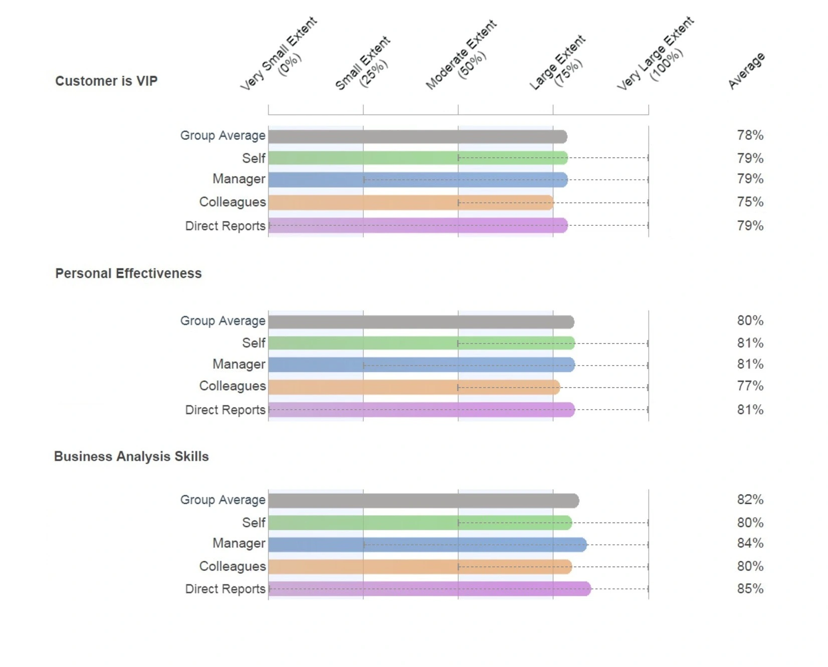
Of the two options (spider graph and bar chart), the author’s preference is to use bar charts for the following reasons:
- The ‘range’ of responses can also be included
- Numerical ratings can also be shown
- They don’t become overly cluttered when more than 3 – 4 feedback groups contribute
- The remainder of the report can also use bar charts, which provides consistency for the reader
- Trends are easier to identify at a glance
David Cooper
Director - Lumus360
www.lumus360.co.uk
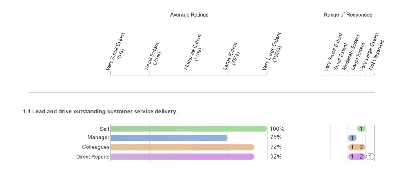
360 feedback report design – Example of how to show the responses to each question
When considering how to present the responses to each 360 feedback question, you should aim to make it easy for the participant to ‘tune in’ to the format/ layout, scaling etc., and then simple for them to identify:
- How each of the feedback groups see/ perceive them - The main themes/ key development messages etc
- Perception alignment/ gaps – How they view themselves against the perceptions of each of the feedback groups and how the perceptions of each feedback group align to each other
- The things to celebrate - The behaviors that are perceived as strengths
- Development opportunities - Those behaviours that are not being perceived to be done as often as they should
- Range of responses – How consistent are the respondents within each of the feedback groups?
Finally, your format should work well for those who prefer to interpret visual displays and those who are more at home with numerical representation.
Whilst we have seen many versions over the years, Lumus360 believe the following example achieves:
- Best practice data presentation principles
- The needs of coaches/ participants
David Cooper
Director - Lumus360
www.lumus360.co.uk
Examples of useful additional sections within a 360 feedback report
As well as providing a summary overview of results and a breakdown by question of the feedback received, other sections can also be included to provide additional insight. This snippet, aims to identify some of the other options and provide a sample of how they can be successfully represented within a 360 feedback report:
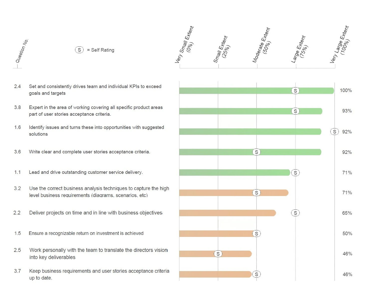
Top and bottom results – A useful way of helping to summarise the key messages (strengths and development opportunities) within the report. Whether you show the top/bottom 5 or 10 results depends on how many questions are in the questionnaire.
A good example would be...
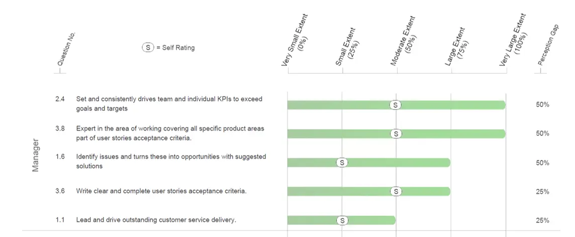
Importance ratings – This table helps participants identify which of the questionnaire competency/ dimension areas are the most important.
As part of the line manager and participant questionnaire, both are asked to rate each competency/ factor with regards to how important they perceive it to be in relation to success in the participant’s current role.
An example of how the results would appear in the 360 report is...
Perception gaps – Showing the greatest differences in perception between the participants ‘self-score’ and each of the population groups can aid the participant to identify ‘hidden strengths’ and ‘blind spots’. Whilst there are many ways of presenting this, to ensure the participant gains the greatest insight form this section, we suggest:
- Showing the greatest differences at question (not competency/ dimension) level
- Showing differences by feedback population group (not as a summary of all respondents)
- Ranking results to enable easy identification of key differences
- Splitting the results into two tables (hidden strengths and blind spots)
- Applying normal best practice…. As a picture with numbers, good use of colour etc.
Need a bespoke report? Lumus360 offer (at no cost) to tailor/ customise all of their standard 360 feedback reports to meet your specific needs
David Cooper
Director - Lumus360
www.lumus360.co.uk
Using qualitative feedback in 360 feedback reports
Qualitative (written text) feedback can greatly enhance a 360 feedback report by providing context to ratings and enabling feedback from outside the boundaries of the multiple choice questions.
Lumus360 firmly indorse the use of qualitative - free text feedback within 360 feedback reports and our experience shows that 360 participants gain as much (if not more) value from the written comments as any other part of the report. The key design questions to ponder are:
- How many free text questions should we include? – The answer to this can be found in the bigger picture. 360 feedback questionnaires should take no-longer than 15 – 20 minutes to complete. Assuming the multiple choice questions take about 8 minutes, that leaves another 8 - 10 minutes for respondents to provide any written comments/ responses. Based on this, we would not advocate any more than 5 – 6 in total
- Where should the free text boxes go? – They work really well when used:
- At the end of competency/ dimension areas to expand on/ contextualise ratings within that section
- At the end of the questionnaire as a ‘catch all’. Here they are very good at helping to summarise key feedback messages and provide additional behavioural feedback on aspects that may not have been easily shared within the main framework of the questionnaire
- How should written feedback be presented? - The key driver here is the level of confidentiality/ anonymity being offered to respondents. Written comments can either be summarised or transcribed. Whilst summarising peoples written feedback comments offers the greatest level of anonymity, it is time consuming (costly) and can be open to interpretation/ misunderstanding errors. Normal practice is to transcribe them verbatim, whilst randomising the sequence in which comments are presented to aid with anonymity/ confidentiality. Lumus360 prefer to show comments by respondent groups but some providers merge all comments for improved confidentiality.
David Cooper
Director - Lumus360
www.lumus360.co.uk
Designing a 360 feedback report as a workbook
Providing guidance notes on how to approach and interpret 360 feedback and then convert that into a meaningful action plan can aid the participant (and their coach) to make the most of the feedback whilst providing consistency of approach.
To achieve this, some/ all of the following additional inserts could be included into the standard reporting framework:
- Journey overview – An introduction that provides context for the feedback activity and outlines both the journey and output/ outcome expectations
- General principles for making the most of 360 feedback – The provision of some top tips for how to approach, interpret and use 360 feedback
- Detailed feedback results - Including guidance notes on what to look for and a template for capturing any key messages/ learning can be really useful
- Action planning - Incorporating guidance on action planning and a good template can support the conversion of feedback into a meaningful development plan
- Follow through plan – Experience shows that only a small percentage of people actually follow through on their development commitments! Providing advice, guidance and a template for success is a great way to increase the likely hood of success
Lumus360 offer both a standard 360 report or feedback can be displayed in a workbook format. Both of which can be tailored to meet your specific needs.
David Cooper
Director - Lumus360
www.lumus360.co.uk

Best practice - 360 feedback report design
The objectives and key considerations when designing a 360 degree feedback report...

Types of 360 Feedback Reports
Most 360 feedback providers offer three core reports (Individual, Comparative and TNA) and this snippet outlines their makeup and intended use.

360 feedback report – Data presentation
Some core principles for displaying 360 feedback data…

Example of best practice 360 feedback reporting – High level summary
The best ways to present an overview/ high level summary of feedback in a 360 feedback report...

360 feedback report design – How to best present the detailed responses to individual 360 feedback questions
Designing a 360 feedback report? - This short article provides the design criterial and a best practice example of how to show the detailed responses to 360 feedback questions...

360 feedback report design – Examples of additional sections
In addition to the core parts off a 360 feedback report, it is also possible to incorporate a range of other graphs and charts. This post provides 3 examples / samples of other useful 360 feedback report sections.

360 feedback report design – Qualitative feedback
Qualitative (free text) feedback is a key component of any 360 feedback report. This snippet outlines the principles for when and how to best incorporate it...

360 feedback reporting in a workbook style
Depending on the context, it can be of real benefit to present 360 feedback results in a ‘workbook’ style/ format in order to provide guidance to participants and consistency of approach...
360 feedback report design – Examples of additional sections
In addition to the core parts off a 360 feedback report, it is also possible to incorporate a range of other graphs and charts. This post provides 3 examples / samples of other useful 360 feedback report sections.